

1. Overview
What is the Rate Management System?
The Walmart Cost Factor Rate Management System is a dashboard designed to streamline the management of department rates and associated expenses. The goal was to migrate from a legacy system to a modern, standalone dashboard that would improve usability and simplify complex processes for purchasers and department managers.

The challenge
Users struggled to navigate the system due to poorly organized data across multiple purchase companies, departments, and rates.

My Role
Heuristic evaluation, design iteration, user needs analysis, stakeholder alignment of goals

focus areas
UX Design,
Dashboard Design, Information Architecture
3. key challenges
Breaking legacy barriers.
The legacy rate management tool posed several usability challenges:
Complex Information Architecture:
Inefficient workflows: The existing system required multiple clicks and screens to access and manage cost data, which slowed down users’ ability to complete tasks efficiently.
Lack of key data visibility: Users had difficulty locating important cost information (e.g., expenses, rates) quickly, hindering decision-making and optimization of workflows.
4. process
Design discovery & research.
While there was no formal research phase, the design was based on:
Internal feedback: Insights gathered from conversations with stakeholders, developers, and team members.
Product requirements: Understanding the business goals, user needs, and pain points from existing workflows.
Personal UX expertise: Leveraging my experience with UX principles to guide design decisions, focusing on simplicity, usability, and clarity.
5. impact
Key features.
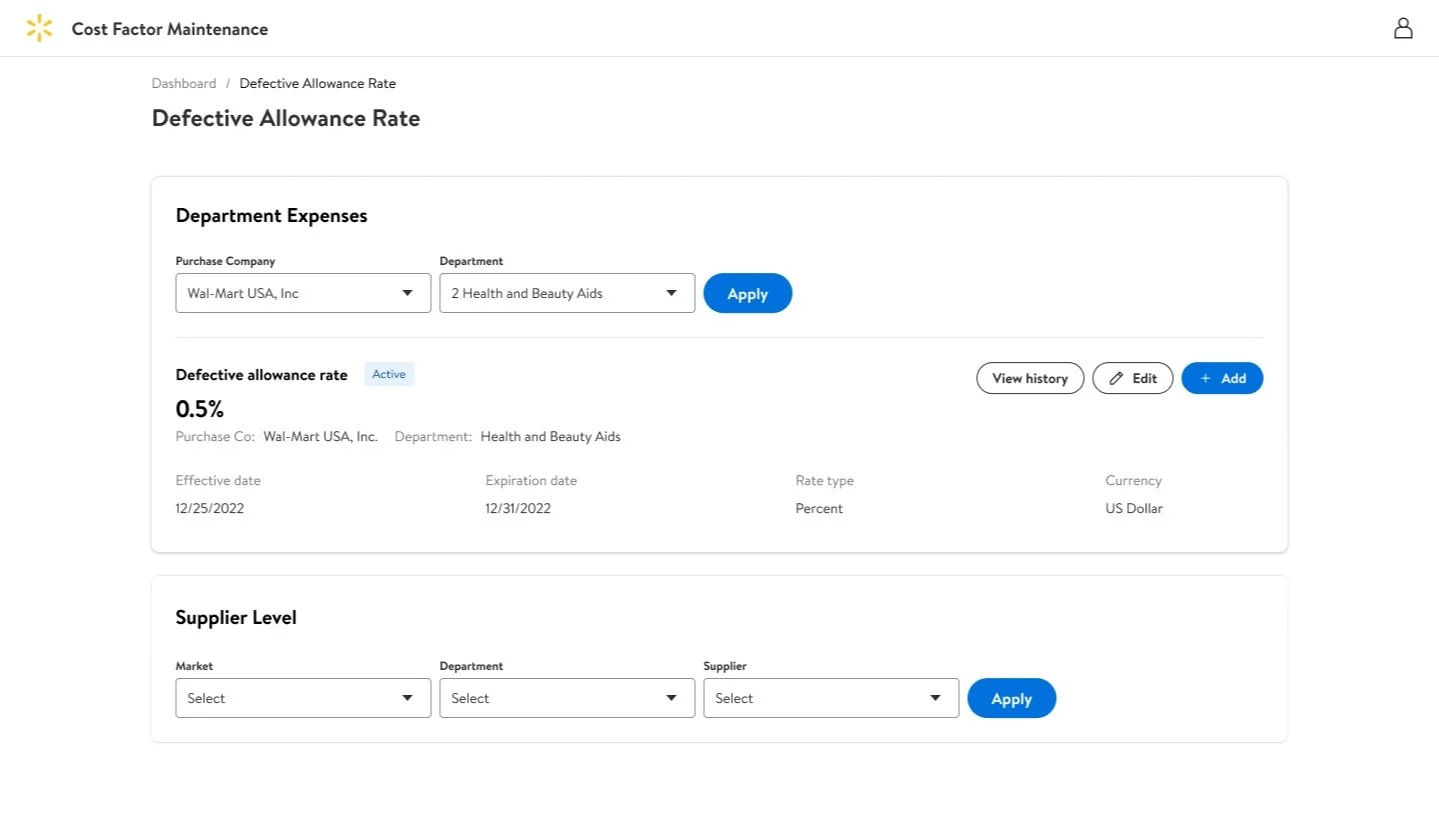
Reorganized information into cards:The dashboard was restructured into cards, each representing a key cost factor (e.g., purchase company, department, rate), providing users with at-a-glance access to important data.
Simplified workflow and reduced Clicks: The user flow was streamlined by reducing unnecessary clicks and consolidating information across fewer screens, allowing users to quickly access and manage cost data.
Enhanced data visibility: Key cost data was surfaced directly on the dashboard, ensuring users could see the most important information upfront and take action quickly.
Results
The new design reduced clutter, improved clarity, and minimized navigation time. Users quickly accessed key data, made faster decisions, and focused more on managing costs. The simplified workflow boosted efficiency, allowing more time for decision-making. Enhanced data visibility helped users make quicker, informed choices.


5.final call
Closings.
Winning moments
Usability and operational efficiency: The redesigned Walmart Cost Factor Rate Management Tool was significantly improved
Time Saved: Users completing tasks 20% faster due to a streamlined workflow and easier navigation.
Error Reduction:Users reporting fewer errors when managing cost data, thanks to clearer and more accessible information.
Improved Decision-Making: Users making quicker, more informed decisions due to better data visibility and organization.
User Satisfaction: High satisfaction from stakeholders, especially regarding the simplicity and speed of the redesigned dashboard.
Lessons Learned
Simplicity drives effectiveness: The new dashboard’s simple and intuitive design significantly improved usability. It shows that clear, user-friendly interfaces lead to better task management and overall efficiency.
Clear layout improves focus: A well-organized, clearly laid-out dashboard helps users focus on key tasks, reducing cognitive load and enhancing productivity. This reinforces the importance of visual hierarchy in design.
Card layout enhances data visibility: The card layout improved data visibility, making it easier for users to track and manage information. This highlights the value of modular design for better organization and quicker access to important data.
User feedback is key for satisfaction: High user satisfaction came from a simple, fast, and functional dashboard. Engaging stakeholders early and iterating based on their feedback was crucial for ensuring the design met user needs.
“The new dashboard is a significant improvement. It’s much easier to manage costs and expenses, and everything is clearly laid out. The design is simple, intuitive, and helps us focus on what matters.”
The card layout is exactly what we needed. It gives us better visibility into our data and makes it much easier to track and manage financials. It’s a huge time-saver.”