
01. overview
Reports Management Tool Redesign.
Career Builder Applicant tracking system was part of a legacy tool built from several stitched together products. Leadership recognized that this was slowing down hiring teams and negatively impacting productivity. They sought a more modern, intuitive experience to simplify the entire reporting workflow.

the challenge
Simplify the process of creating, saving, and managing candidate reports tied to requisitions—making it faster and with fewer screens.

key issues
Difficult to learn, Slow to navigate, Causing cognitive overload for recruiters trying to surface key information quickly.

My Role
Design discovery, heuristic evaluation, stakeholder alignment and user
needs analysis.

focus areas
UX Design, Information Architecture
Dashboard Redesign, User Research
02. key challenges
Breaking legacy barriers.
Through research and heuristic audits, we uncovered several key issues:
The system lacked modern filtering and sorting capabilities, making it harder to quickly find relevant data.
Most users couldn’t easily determine which reports were tied to specific candidates or requisitions, resulting in confusion.
The report creation flow involved too many clicks and screens, leading to unnecessary friction.
Users struggled to locate pre-saved or custom reports, wasting valuable time.
The result: Frustration, inefficiency, and reports that were often misused or overlooked.
Poor Information architecture
Hidden reports
legacy platform
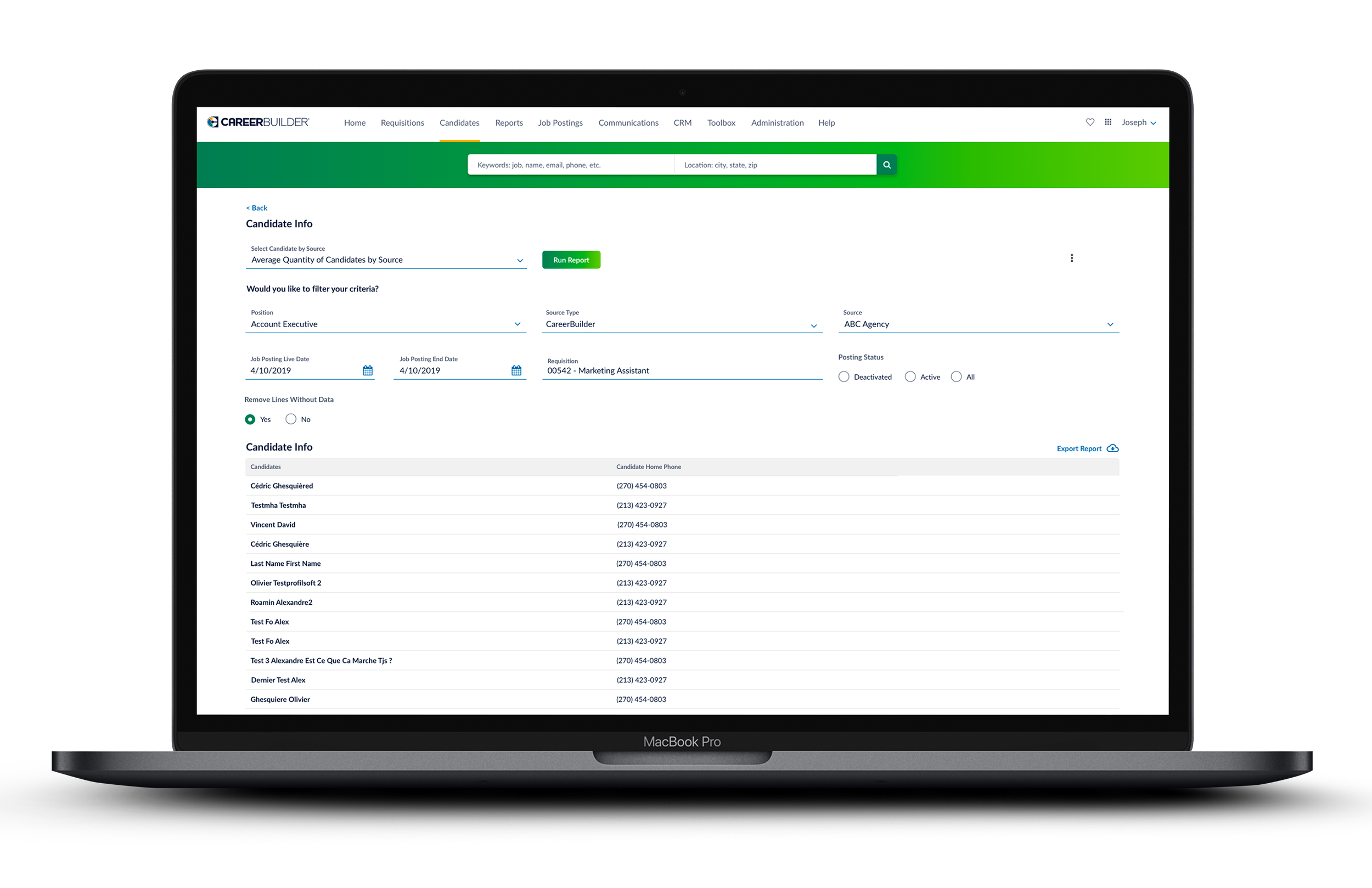
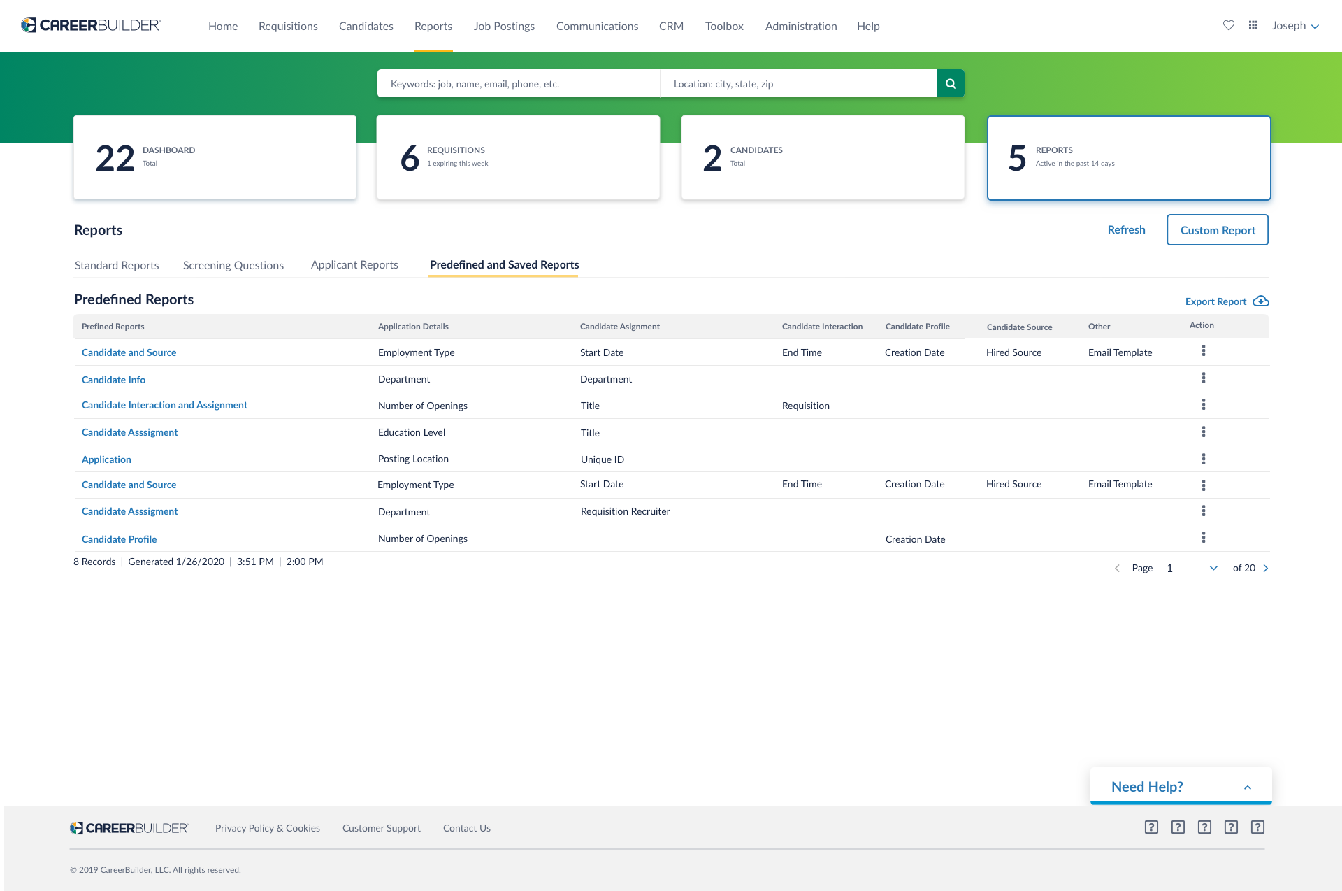
3. solutions
UX strategy.
To address these pain points, I collaborated closely with product, engineering, and internal recruiters to fully understand the friction in the existing system and identify areas for improvement. By aligning the design with other existing products, we aimed to create a more cohesive experience and empower users to work more effectively.
Designing intuitive flows that prioritized speed and provided clear context.
Reducing the number of screens and steps required to create or locate a report.
Surfacing relevant information (e.g., requisition type, candidate status) earlier in the workflow.
Improving labeling, hierarchy, and navigation for better user clarity and efficiency.
Improve design consistency by enhance the user experience of the reports dashboard across the CB ecosystem
Streamlining the process of finding requisitions linked to candidates more efficiently.
Addressing the inability to access key metrics, which were essential for users to achieve their goals and optimize their day-to-day tasks.
Our approach.
Screening Questions and Applicant Reports
Custom reports


Predefined and saved reports

4.closing
The final call.
Winning moments
““This is such an improvement over how we used to manage and maintain reports. You’ve simplified so many steps and screens—this is exactly what we needed!”
Before, we didn’t have a way to save custom reports. Now, we can filter and save reports for candidates and requisitions. It’s a game changer!””
Lessons learned
Streamlined reporting experience: Simplifying the reporting flow improved user satisfaction, but deeper user testing with diverse personas is needed to ensure it’s intuitive for all users.
Enhanced workflow yisibility: Visibility into the workflow helped users, but additional context (e.g., dynamic prompts) is needed to reduce ambiguity and provide clearer guidance on next steps.
Successful internal validation: Internal validation confirmed the design’s effectiveness, but early engagement with a broader group of external users could prevent misalignments between stakeholder needs and real-world use.