
at a glance
Streamlining commercial
quoting engine.
Saved insurance agents ~20% of their time
Helped unlock a previously avoided commercial insurance revenue stream.A redesign of the commercial quoting workflow focused on helping agents keep the customer conversation moving while completing a quote. Working within an existing enterprise system, the project used targeted interaction changes rather than a large-scale visual overhaul.
challenges
Agents were avoiding commercial insurance because the quoting process was rigid, time-consuming, and disruptive to customer conversations.
My role
Research & Interaction Design — discovery, heuristic evaluation, workflow design, and developer alignment.
constraints
Improved workflow flexibility within a fixed, tablet-sized container—improving workflow flexibility no viewport, visual or major backend changes.
the friction
SUS score 27
State Farm agents were actively avoiding business insurance conversations because the legacy quoting experience was a major bottleneck.
The viewport blocker
The system was confined to a centralized, tablet-sized viewport—even on desktop monitors.
The flow killer
The form was strictly sequential. Agents couldn't advance until every field on the current screen was completed, forcing them to interrupt live customer conversations to search for missing information.
The Voice of the User
We don't offer Business insurance because the process is painful and time consuming. - Agent
No visibility into unanswered questions
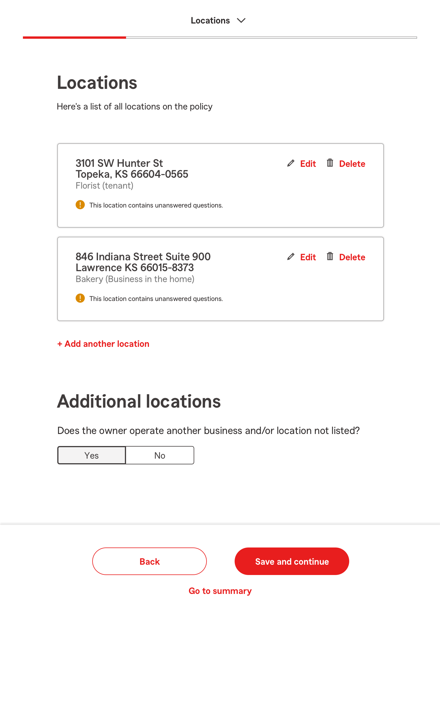
Agents couldn’t easily see which questions were incomplete or required further input, making it hard to finalize quotes efficiently.
The redesigned experience
Surfaces unanswered questions and gives agent a clear way to addresss them.

Ux strategy
Four interaction
improvements.
Because I couldn't expand the viewport or redesign the core visual system,
I focused on improving the interaction logic within the existing constraints.
1.Conversational Pausing
Added a Save & Resume state so agents could pause a quote during a customer conversation and return to it later without losing progress.
2. Flexible Progress
Made the multi-step wizard more flexible, allowing agents to skip fields they didn't know yet, move between sections, and keep the conversation flowing naturally.
3. Clearer Progress Tracking
Added subtle status cues to the narrow navigation tree so agents could see which sections were incomplete at a glance.
4. Reduced Interruptions
Warning modals interrupted agents' workflow and took up valuable space in the fixed viewport. I redesigned the interaction so agents could acknowledge a warning with a checkmark and dismiss it without leaving their current context.


constraints
Designing
through constraints.
Great UX isn't always about designing the ideal interface. Sometimes
it's about finding the smallest viable change that engineering can actually ship.
Our first concept failed
Forced a rapid pivot.
The failed concept
I initially designed section-skipping mechanics directly into the platform's global dropdown menu.
The reality check
Early collaboration with engineering revealed that the backend architecture couldn't support the approach within the existing fixed container.
The pivot
I worked directly with developers to create a lighter navigation-state system that delivered the same workflow flexibility without requiring database changes or a visual overhaul.
final call
The takeaway.
The breakthrough wasn't a new interface—
It was a new interaction model.
By working within the existing system rather than fighting its constraints, I turned a rigid, sequential quoting process into a more flexible workflow that better matched how agents actually worked.